Amber Rooftops and Sapphire Seas


Date: 10/31/2012

 Location: Kona Village Resort

 Size: 24" x 36"

 Medium: Oil on stretched canvas

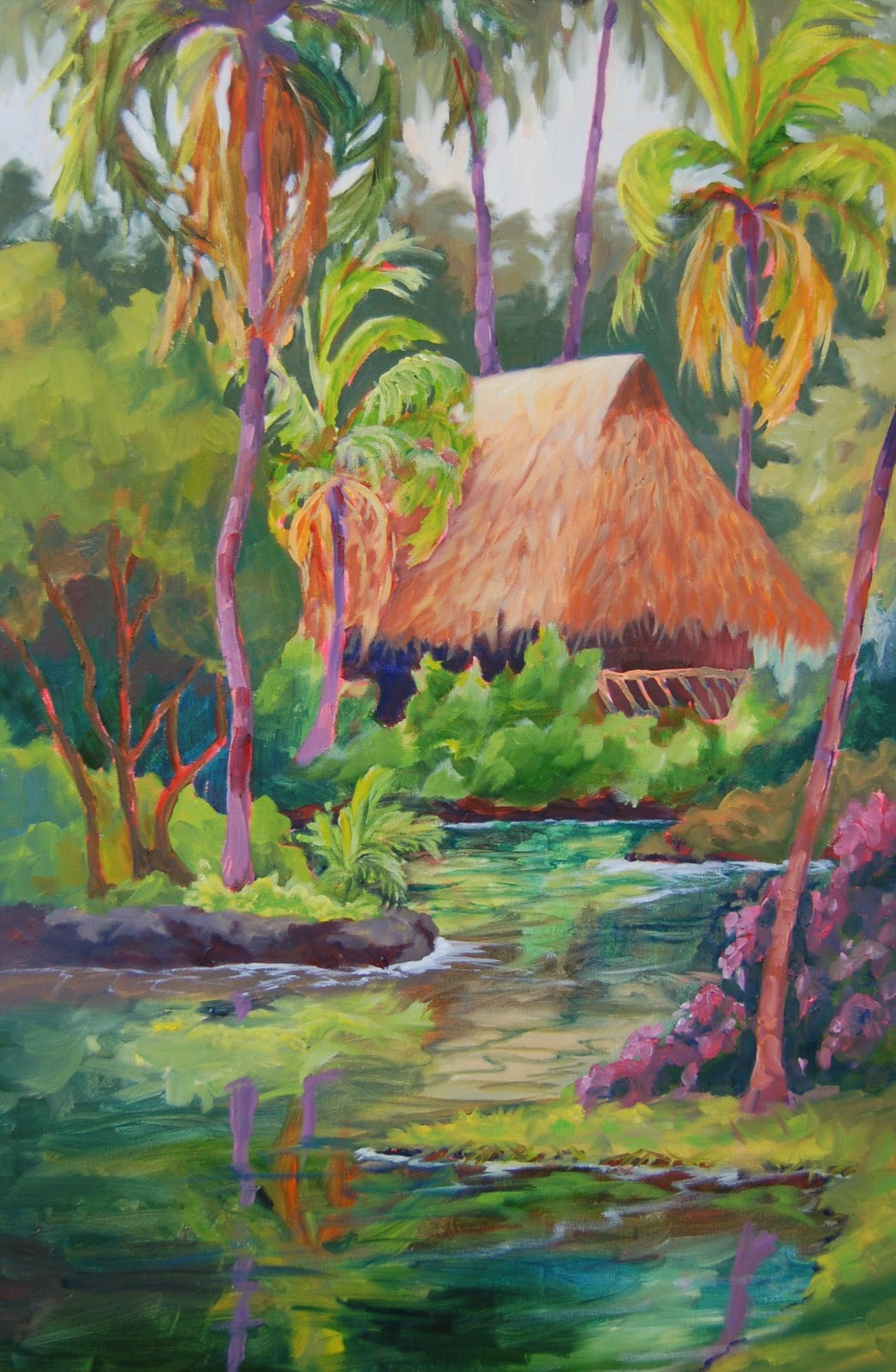
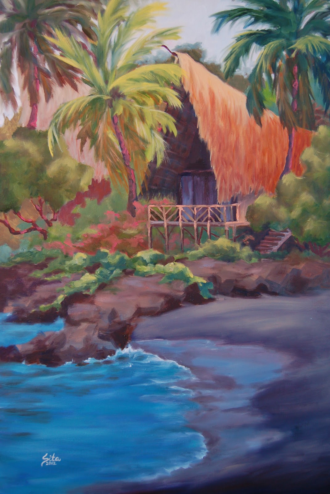
 Artist's Comments: While working on a project to create a water-scene of the Kona Village Resort, I painted a scene along the shore of the fresh-water ponds.  When I finished, I remembered that there were some wonderful Hales dotted along the ocean's edge.  So, I decided to create a secondary option for the client to see which they preferred.  Finding a hale that offered me the perfect angle allowing me to capture sandy shoreline, ocean and a great angle of the structure would be difficult but, I located the perfect subject - Hale NH4.  Perched at the edge of a private black sand beach, this particular hale offered a stunning composition to paint. As I worked on the painting I realized quickly I would need to capture the value change of the top of the lava rocks compared to the top of the sandy shoreline. I pulled on the skills I had learned earlier this year from John Cosby and I was so impressed with my ability to render what I had learned. I feel I really conveyed the sense that the lava rocks are on a different plane than the sand dunes and that the building and trees rise above the scene.  Keeping this value and tonal change consistent through my painting process was difficult.  I had an especially difficult time keeping the lava rocks from blending in with the sand but, in the end I was able to figure it out.  My favorite part about the painting is how the amber thatched rooftops pops against the sapphire sea.

 To view other paintings in my collection, click on the section labeled "View all SitaScapes" located at the top right of my blog. I have categorized my paintings by the month as I complete them.

A Jewel in the Tropics


Date: 9/15/2012

 Location: Kona Village Resort

 Size: 24" x 36"

 Medium: Oil on stretched canvas

 Artist's Comments: I was honored to be asked to paint a scene of Kona Village that would hang in the same room as a large triptych by Darrell Hill.  He is such a hero, mentor and inspiration to my work!  My very 2nd oil painting workshop was with him on A-Bay and since then, he has provided such guidance and inspiration to my work.  The client selected Kona Villa as the subject and they were totally open to what I wanted to create   with the exception that they wanted water to be a primary element in the painting and, the color scheme needed to compliment the Darrell Hill painting.  I wanted allot of color in this piece as Darrell's use of color is amazing! However, I didn't want the colors to match; yet rather compliment. Darrell uses allot of yellow or orange as accents so I decided to go with my signature highlight - pink.  I wanted a nice feeling of light on the hale with the rest of the landscaping on the edges to be slightly darker so the eye is drawn into the painting.  The teachings learn from my John Cosby workshop kept ringing in my ears ... "push the light" he use to repeat over and over.  I wanted the reflections in the pond to be abstract, fluid and serene.  I typically use a rich blue for the sky but, I felt if I used this strong of a color in the sky, the eye would be distracted up off the canvas. So I selected a dull color just to provide the sense of light rather than color.

 To view other paintings in my collection, click on the section labeled "View all SitaScapes" located at the top right of my blog. I have categorized my paintings by the month as I complete them.
The artist does not authorize the use or reproduction of any images within this site by any third-party. To receive usage approval, please contact the artist.